
I've tried to broaden my horizons by adding a Burgundy & a MG recently, but the thrill of a good deep FG is still impossible to beat. This thread makes me want to sell my 350V63BG & my newly aquired 330MG & replace them with a proper colour!! (Not going to though....I'm going to tough it out!)
I am very glad that the factory has addressed the modern 'bright' FG though, I can now consider buying a brand new gtr in the FG finish. I'd like to see one in the flesh, so to speak.
New Fireglo Finish?
Moderator: jingle_jangle
-
tony_carey

- Advanced Member
- Posts: 2055
- Joined: Thu Oct 28, 2004 6:00 am
- Contact:
-
tony_carey
- Advanced Member
- Posts: 2055
- Joined: Thu Oct 28, 2004 6:00 am
- Contact:
Damn Kev, that is a fantastic FG on the 360. That is typical of the early '90's colour...absolutely beautiful. My '90 360V64-12 is really dark like that. My '97 330 is different, not quite as dark around the edges, but the red is so deep, almost a burgundy...really gorgous.
'Rickenbacker'...what a name! After all these years, it still thrills me.
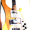
http://users.telenet.be/webruimtev/my360v64.JPG
1994 sprayed fireglo
have I mentioned I like this one already?
1994 sprayed fireglo
have I mentioned I like this one already?
-
melibreits

- Senior Member
- Posts: 4081
- Joined: Wed Mar 12, 2003 6:00 am
- Contact:

-
tony_carey
- Advanced Member
- Posts: 2055
- Joined: Thu Oct 28, 2004 6:00 am
- Contact:

Thanks Tony and Melissa. Unfortunately, something has to go, so I have just listed that 370/12 VP in the For Sale section.
I believe 1989 through 1993 were the best years for Fireglo. I also have a 1994 370/12 WB that looks very similar to the 360V64 in the link above. More "reddish" than the 1993 models but still very attractive.
I believe 1989 through 1993 were the best years for Fireglo. I also have a 1994 370/12 WB that looks very similar to the 360V64 in the link above. More "reddish" than the 1993 models but still very attractive.
I'm glad some people do know how to photograph Fireglo. I'm so sick of people trying to make comparisons using photos produced with cheap digital cameras and/or with little skill or care, and on computer monitors.
There's one guy on another forum that really drove me over the edge on this point.
Of course, what's really funny is that the guitar with absolutely the best(worst) example of a dark red band around the edge is George Harrison's original 12 stringer.
There's one guy on another forum that really drove me over the edge on this point.
Of course, what's really funny is that the guitar with absolutely the best(worst) example of a dark red band around the edge is George Harrison's original 12 stringer.
Wow! That 370 is a stunner, Kevin! Sad that you have to let it go. There was/is a 370/12FG here in Melbourne and the finish was really quite red, which I don't mind at all, although like Tony I prefer the older, darker finishes.
Wonder what my 360/6 will be like when it arrives..............
John: I have an expensive camera - pity about the cheap photographer!!
Wonder what my 360/6 will be like when it arrives..............
John: I have an expensive camera - pity about the cheap photographer!!
"Never eat more than you can lift." - Mr. Moon
-
jingle_jangle

- RRF Moderator
- Posts: 22679
- Joined: Wed Dec 22, 2004 6:00 am
- Contact:
John: Any tips? Methods that work better than others?
Personally, very few of my digital photos go out without some tweaking. I learned Photoshop way back in '95, and there's nothing better IMO to get things looking just right. I have a very good SONY (DSC F717) and it, too is a big factor, since color temp is adjustable on it.
Personally, very few of my digital photos go out without some tweaking. I learned Photoshop way back in '95, and there's nothing better IMO to get things looking just right. I have a very good SONY (DSC F717) and it, too is a big factor, since color temp is adjustable on it.
“I say in speeches that a plausible mission of artists is to make people appreciate being alive at least a little bit. I am then asked if I know of any artists who pulled that off. I reply, 'The Beatles did.”
― Kurt Vonnegut
― Kurt Vonnegut
I took the picture of mine with a Nikon 4500 a while back.
I had a Nec monitor which was well calibrated for editing pictures, but at this time I use a Sony TFT which is actually quite **** when it comes to colours. But it saves a lot of space.
I left the picture unaltered but I have no idea if it looks ok, on my monitor it's on the dark side.
For reference you can use the Amp, I guess everyone knows the colour of a tweed Fender.

Paul, I wish I could tell you all the tricks but I haven't always had the best success either.
I don't think it's a matter of color temperature setting so much, as that's more a function of the light source and the overall coloration.
It must be more a matter of the contrast ratio. As I recall, your eyes can detect at 30,000 to 1, color film/transparency is upwards of 5000 to 1, whereas early or simple digital cameras are only about 500 to 1. In a nutshell, it means there's not enough steps of color variation to do a nice gradation.
One thing for sure- flash does nothing for a guitar. Use existing light and a tripod.
Jeffrey Scott would be the best person here to comment.
-
jingle_jangle
- RRF Moderator
- Posts: 22679
- Joined: Wed Dec 22, 2004 6:00 am
- Contact:
I've discovered through experimentation, like you, that flash just doesn't do guitars any justice. Everytime I give it a shot, I get weird colors, unnatural highlights and washed-out data.
So it's available light and a bit of a bump in brightness and contrast in Photoshop. Of course it helps to have a digital SLR so that exposures can be long and apertures stopped down to take advantage of the data available. Of course, with Photoshop, "garbage in, garbage out", so the more data on detail that can be captured, the better off we are. In really important "art" shots, I bump the picture size way up and work with the big image, then bump up the resolution as I shrink the image down.
Jeff? Does this make sense?
“I say in speeches that a plausible mission of artists is to make people appreciate being alive at least a little bit. I am then asked if I know of any artists who pulled that off. I reply, 'The Beatles did.”
― Kurt Vonnegut
― Kurt Vonnegut
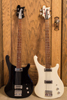
I think most of the above mentioned comments relate to the final outcome. Something that I wonder is, how do the photos of my basses that I post here look on other folk's monitors? I can get them to look decent on mine but does the FG of my 4001, for example, look pink or even green on someone else's monitor? Is it too dark, too light? I have no idea. Digital imaging has made things easier for many but at the same time it has created a major problem for many in the industry.
Just today I was trying to set up my new flat panel digital monitor on my new computer and I used this image to try and get it right:

Using an RA-4 8x10 print, and the digital file brought up in Photoshop on both computers I can get it to look similar to that of my old monitor (the old computer has a Trinitron monitor) but certainly not the same. I even compared it to the bass and you know what, it can't be done! Transilluminated images and reflected light images are just about impossible to match up, not to mention comparing it to the real thing.
For the above shown photo, I used tungsten hot lights (~3200K) in both large scoop reflectors and 8" fresnel units. A black seamless paper background with white foamcore to make the chrome white helped to make the features pop out. The camera was a Minolta Dimage A1 with the white balance set to auto. A lot of the look comes from getting the lighting right, it is usually better to have the lighting ratio from highlight to shadows a bit on the low side to avoid too much contrast, as it is much easier to add contrast than to remove it. This photo looks good but if you were to compare it to the actual bass in similar lighting you will see that image of the bass is a bit on the warm/yellow side and the pickguard and chrome highlights are a bit blue. This makes it virtually impossible to totally correct without a lot of work in Photoshop, something that I know about .00000000001% about! I know just enough to get me in trouble. Maybe we should have a Forum photo workshop!
How's this look?

Just today I was trying to set up my new flat panel digital monitor on my new computer and I used this image to try and get it right:
Using an RA-4 8x10 print, and the digital file brought up in Photoshop on both computers I can get it to look similar to that of my old monitor (the old computer has a Trinitron monitor) but certainly not the same. I even compared it to the bass and you know what, it can't be done! Transilluminated images and reflected light images are just about impossible to match up, not to mention comparing it to the real thing.
For the above shown photo, I used tungsten hot lights (~3200K) in both large scoop reflectors and 8" fresnel units. A black seamless paper background with white foamcore to make the chrome white helped to make the features pop out. The camera was a Minolta Dimage A1 with the white balance set to auto. A lot of the look comes from getting the lighting right, it is usually better to have the lighting ratio from highlight to shadows a bit on the low side to avoid too much contrast, as it is much easier to add contrast than to remove it. This photo looks good but if you were to compare it to the actual bass in similar lighting you will see that image of the bass is a bit on the warm/yellow side and the pickguard and chrome highlights are a bit blue. This makes it virtually impossible to totally correct without a lot of work in Photoshop, something that I know about .00000000001% about! I know just enough to get me in trouble. Maybe we should have a Forum photo workshop!
How's this look?