
SO, here it is Tuesday...which of course is San Francisco's answer to Monday...
And I have an announcement to make!
After sending the winners to Peter, and Peter forwarding them to John Hall at RIC for legal approval, we have concluded that, despite the excellent graphic quality of the winners and in most cases their terrific suitability for the topic sections for which they were intended, there are two overriding concerns which must be addressed.
FIRST:
We all backed away from a blanket RickResource Forum logo, far too soon. There were only a couple of logos presented for the Forum itself which began to approach the quality of the logos submitted for the topic headings.
SECOND:
To give each topic heading a logo, cost needs to be considered. This site gets tens of thousands of hits each week, and to accommodate the additional bandwidth required to display each logo for a percentage of these hits, gets to be very pricey. So it looks like, for the time being at least, the topic headings will be on hold.
There is a third issue, which is that a majority of the topic headings do not conform with RIC requirements in terms of how they display protected marks, but that is a non-issue at this point in time.
CONCLUSION
At this time, what we'd like to see are some more submissions for a general Forum heading only. Only one winner will be chosen. The criteria are the same as before. Please incorporate the "RickResource Forum" wording into your submission. Note that if you represent any protected "trade dress" item in your submission, it must be in photographic form; i.e., no sketches, drawings or computer-generated images are allowed. Computer-modified photographic source material is permissible.
Deadline on this one will be December 1, 2006.
RickResource Forum Logo Contest
Moderators: rickenbrother, ajish4
-
jingle_jangle
- RRF Moderator
- Posts: 22679
- Joined: Wed Dec 22, 2004 6:00 am
- Contact:

-
jingle_jangle
- RRF Moderator
- Posts: 22679
- Joined: Wed Dec 22, 2004 6:00 am
- Contact:
AArrrgghhh. Don't tell me that DC Doublespeak is filtering out here. Better editing makes a better..er...you know.
“I say in speeches that a plausible mission of artists is to make people appreciate being alive at least a little bit. I am then asked if I know of any artists who pulled that off. I reply, 'The Beatles did.”
― Kurt Vonnegut
― Kurt Vonnegut

-
myfretless
- Member
- Posts: 442
- Joined: Sat Aug 06, 2005 1:43 am
-
jingle_jangle
- RRF Moderator
- Posts: 22679
- Joined: Wed Dec 22, 2004 6:00 am
- Contact:
Jeez, Brad, I though my own English was plain enough...
We produced a couple of usable RRF logos. Then people got diverted and started to design topic area logos. Many of these were excellent, but when submitted to RIC legal, most didn't pass muster.
So, I'd like to redirect everyone's attention to designing THE NEW RRF logo. We'll hold the topic logos for possible future use, with some mods to pass RIC scrutiny.
“I say in speeches that a plausible mission of artists is to make people appreciate being alive at least a little bit. I am then asked if I know of any artists who pulled that off. I reply, 'The Beatles did.”
― Kurt Vonnegut
― Kurt Vonnegut

-
markbass99

- Intermediate Member
- Posts: 1267
- Joined: Sun Mar 14, 2004 7:23 am


Thanks Mark. I hope that this is the beginning of a new wave of submissions.
Life, as with music, often requires one to let go of the melody and listen to the rhythm
Please join the Official RickResource Forum Facebook Page https://www.facebook.com/groups/379271585440277
Please join the Official RickResource Forum Facebook Page https://www.facebook.com/groups/379271585440277
-
actual_size
- New member
- Posts: 86
- Joined: Wed Jan 14, 2004 3:30 pm
Paul,
I think Brad raised a legitimate question.
“How about an example as to what could be used or improved upon? (i.e. a topic heading that could have been used but for the cost)”
To that I would add these:
“We produced a couple of usable RRF logos.”
As a point of reference. Which ones were they? And and what qualified them as “usable”?
“Then people got diverted and started to design topic area logos.”
If this is now a “diversion”, why was this direction encouraged?
“Many of these were excellent, but when submitted to RIC legal, most didn't pass muster.”
Which ones, and why didn’t they “pass muster”?
“We'll hold the topic logos for possible future use, with some mods to pass RIC scrutiny.”
Could you please be specific as to what “mods” would pass RIC scrutiny?
Brief but specific rules with accompanying visual examples where possible would be helpful for all of the above.
Since there are quite specific design and legal criteria that need to be adhered to. It would greatly benefit everyone interested in submitting designs if they knew exactly what they were. Knowing what is and is not acceptable before people invest their time and energy will eliminate any confusion, and will only make the submitted designs stronger and more relevant. And more fun too.
-
markbass99
- Intermediate Member
- Posts: 1267
- Joined: Sun Mar 14, 2004 7:23 am
Steve- I'm no expert on this, but the two key issues I see are it has to be a photograph image and it has to say Rickresource not Rickenbacker. RIC is in a position that enforcing duplication of their protected products(guitars,basses) also must include protection of duplicated copyrighted images, photographs don't fall into that category. If RIC were to let this forum use duplicated images(like graphics), it would be also saying that it's alright for anybody else to do the same, and they're not going to do that. That's the way I interpret it anyway.
73 Feb 4001, 73 March 4001, 73 April 4001, 73 May 4001, 73 June 4001, 73 July 4001
04 MM Bongo 5HSp, 07 MM Bongo 5HS, 09 MM Bongo 5HS, 09 MM Bongo 5Hp, 11 MM Bongo 5H
04 MM Bongo 5HSp, 07 MM Bongo 5HS, 09 MM Bongo 5HS, 09 MM Bongo 5Hp, 11 MM Bongo 5H
-
jingle_jangle
- RRF Moderator
- Posts: 22679
- Joined: Wed Dec 22, 2004 6:00 am
- Contact:
Mark, I think that is very well put.
Additionally:
This was originally--and remains--a contest to design a RRF logo.
I believe, Steven, if you read the posts from the very beginning, you'll find most of your concerns addressed.
I don't believe that anything in terms of topic heading logo design, was encouraged except the excellence of some of the designs. I don't remember either Peter or I ever suggesting separate logos for each topic heading.
John Allgaier did, though, on August 11:
"May I suggest the non-winning entries could be used for topic appropriate banners at the top of the individual topic forums?"
Perhaps this was not discouraged at the time because Peter was then unaware of the substantial extra bandwidth cost--I'll let him comment on this if he chooses.
By August 13, this idea had taken hold as a "given". Sheena posted, in response to one of your own excellent submissions:
"Steven: good job, how about the other sections?"
I do remember my surprise (and pleasure) when these started cropping up and self-propagating!
By August 13, this was firmly rooted, and most submissions after that date were for topic heading logos.
Now I'm going to give a brief, but by no means hyperdetailed, overview critique of the same type which I withstood through my own six years at design university back in the Sixties, and which I now find myself giving my own students on a daily basis (although it is usually not logotypes which I'm commenting on, and I'm much more, er, direct when standing in front of a class of my design students:
The first logo which had potential, although its proportions were wrong (not banner), and its resolution too low (compression artifacts were present), was Brian Medway's from August 10, the very first day. The typography was too plain, but it did show promise. And it used a photo of a Rick.
Peter himself chimed (jingled?) in with one the next day, although it, too was misproportioned.
Mark Sanders showed the first real contender, with his 1996 one from 8-11. "It didn't take long!" I thought at the time....
Then, on the same day, his FG360 one and JG360 one appeared; both of these were very impressive and professional.
However, the "Postcards" one from the same day, was the first graphically really excellent one and if the contest never took place or would have ended right then, it would have been the winner. I especially liked the way it extended the vision beyond a photo of a Rick and some typography, and gave the Forum a world flavo(u)r.
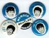
Your own first submission on 8-13 was also the beginning of some great stuff from you. The Beatles logo was the first with the "supertype" backgrounds. Sheena loved the background color (no surprise--she's a green person), but I would've preferred a more neutral background color. Green is tough to use in a logo, for some odd reason, in my experience.
I think our initial "winners" list, with both Forum and topic heading logos, was dominated by yours and Mark's submissions, Steven. But many failed to survive the dual gamut of bandwidth and JH's legal requirements.
Specific legal criteria were mentioned early on in the submissions, and have been reiterated at least a couple of times since. but here goes again, in different language: any depiction of a RIC protected graphic or design feature must be in the form of a photograph or photographic effect, not a sketch or drawing or similar graphic method. In the minority of hypothetical cases where one type of depiction crosses over into the other, JH would make the call.
The issue of holding the topic logos for later use, can be addressed at a later date, should the decision ever be made by Peter to use the topic logo winners.
Additionally:
This was originally--and remains--a contest to design a RRF logo.
I believe, Steven, if you read the posts from the very beginning, you'll find most of your concerns addressed.
I don't believe that anything in terms of topic heading logo design, was encouraged except the excellence of some of the designs. I don't remember either Peter or I ever suggesting separate logos for each topic heading.
John Allgaier did, though, on August 11:
"May I suggest the non-winning entries could be used for topic appropriate banners at the top of the individual topic forums?"
Perhaps this was not discouraged at the time because Peter was then unaware of the substantial extra bandwidth cost--I'll let him comment on this if he chooses.
By August 13, this idea had taken hold as a "given". Sheena posted, in response to one of your own excellent submissions:
"Steven: good job, how about the other sections?"
I do remember my surprise (and pleasure) when these started cropping up and self-propagating!
By August 13, this was firmly rooted, and most submissions after that date were for topic heading logos.
Now I'm going to give a brief, but by no means hyperdetailed, overview critique of the same type which I withstood through my own six years at design university back in the Sixties, and which I now find myself giving my own students on a daily basis (although it is usually not logotypes which I'm commenting on, and I'm much more, er, direct when standing in front of a class of my design students:
The first logo which had potential, although its proportions were wrong (not banner), and its resolution too low (compression artifacts were present), was Brian Medway's from August 10, the very first day. The typography was too plain, but it did show promise. And it used a photo of a Rick.
Peter himself chimed (jingled?) in with one the next day, although it, too was misproportioned.
Mark Sanders showed the first real contender, with his 1996 one from 8-11. "It didn't take long!" I thought at the time....
Then, on the same day, his FG360 one and JG360 one appeared; both of these were very impressive and professional.
However, the "Postcards" one from the same day, was the first graphically really excellent one and if the contest never took place or would have ended right then, it would have been the winner. I especially liked the way it extended the vision beyond a photo of a Rick and some typography, and gave the Forum a world flavo(u)r.
Your own first submission on 8-13 was also the beginning of some great stuff from you. The Beatles logo was the first with the "supertype" backgrounds. Sheena loved the background color (no surprise--she's a green person), but I would've preferred a more neutral background color. Green is tough to use in a logo, for some odd reason, in my experience.
I think our initial "winners" list, with both Forum and topic heading logos, was dominated by yours and Mark's submissions, Steven. But many failed to survive the dual gamut of bandwidth and JH's legal requirements.
Specific legal criteria were mentioned early on in the submissions, and have been reiterated at least a couple of times since. but here goes again, in different language: any depiction of a RIC protected graphic or design feature must be in the form of a photograph or photographic effect, not a sketch or drawing or similar graphic method. In the minority of hypothetical cases where one type of depiction crosses over into the other, JH would make the call.
The issue of holding the topic logos for later use, can be addressed at a later date, should the decision ever be made by Peter to use the topic logo winners.
“I say in speeches that a plausible mission of artists is to make people appreciate being alive at least a little bit. I am then asked if I know of any artists who pulled that off. I reply, 'The Beatles did.”
― Kurt Vonnegut
― Kurt Vonnegut

Ahem. So that's why i was having the hiccups... of course, it was all my fault... Kiddin'.
So, would it be right to say that in short, the logo:
a) should be of proportion 569 x 125 pixels;
b) resolution - 300 dpi minimum;
c) should feature a picture of a RIC product with no alterations made to the photo;
d) feature the words "RickResource Forum";
e) preferably be in the same color pattern as the site (tan & brown).
Is it somewhere close?
Nothing will get you dead quicker than being deadly serious about yourself.
-
jingle_jangle
- RRF Moderator
- Posts: 22679
- Joined: Wed Dec 22, 2004 6:00 am
- Contact:
(a) is roughly correct; I'd say that the range of 125 X 550-125 X 600 would be acceptable, proportion-wise.
And (b) is true for submissions, even though they will display at the web standard 72dpi screen resolution.
(c) and (e) are not entirely correct. Photos can be modified, but there is a point at which they look less like photos than other graphics. Pushing beyond this point with a modification will cause the logo to require reworking or be rejected; limiting the logo to tan and brown would probably be too restrictive.
Thanks for helping us to define criteria with more precision, Sheena.
“I say in speeches that a plausible mission of artists is to make people appreciate being alive at least a little bit. I am then asked if I know of any artists who pulled that off. I reply, 'The Beatles did.”
― Kurt Vonnegut
― Kurt Vonnegut