Paul, question: are the pics in the calendar closer to the "real thing" as far as color? I ask specifically about Melissa's two guitars, her turq 325 and "Pretty Purple". When I've seen those pics (or ones very much like them) posted here, the colors look pretty different.
I understand you may not have seen some or most of these guitars in person, but of the ones you have seen, are the calendar colors true?
BTW, this is not at all a "critique". I just realize that one person's monitor will not match another, and was curious which way my own went.
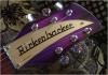
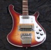
I can answer your question, Jerry.... In the calendar the colors of my guitars look very washed-out compared to how they really look.... All I can figure is that they didn't get it quite right at the print shop.... In real life, Pretty Purple is vibrant, rich and deep, and in the calendar she looks a rather alarming Barney purple--NOT a good representation at all. That is one of the pictures that Paul took and posted here, and Paul's pictures were accurate, so the print shop must be to blame. Also, when my husband and I took the pictures of my turquoise 325, we made sure to adjust the colors to be an exact representation before burning the disk to send to Paul, so again I think it got washed out in the printing process--my 325 is a very deep greenish shade of turquoise in real life (as are the pillows she was resting on!).... Nonetheless, the picture still looks great of that guitar, just not as vibrant as the real thing.
"Once I've held and played the best, baby, I won't settle for less!"
Thanks, Melissa. I was thinking maybe that was the case. The calendars pics are great, no question, but I guess it was really your two guitars I was wondering about, since they are "unusual" colors. The pics I had seen here on the forum were drop-dead gorgeous, and your 325 looked almost like a metallic turquoise. On the calendar it looks pretty, but a bit flat.
Still, loving the calendar, and as a bonus, I'm very glad to hear that Pretty Purple is NOT Barney Purple!
Me too, Jerry.... If Pretty Purple came back to me Barney purple I would not be so in love with it (BLECCCCCHHHH!!!!), and I would be very unhappy indeed, since I sent Paul an example of the exact shade I wanted. Fortunately he was able to match it to perfection (I never had any doubts about that), and it is so gorgeous that no photo could completely do it justice.
"Once I've held and played the best, baby, I won't settle for less!"
Mine is probably waiting for me at my office. I would normally have ordered one to approve the colors before I released it for sale. That way I can tweak the colors to get them nice and rich and accurate, re-upload the tweaked files and everybody's happy. It was like this with the t-shirts--colors were a bit off so I bumped up the files a bit.
But things were running so late that I just crossed my fingers and let it be. Bit silly, really, since if they ask for 200DPI files, you'd think they'd check the contrast and saturation with the files.
Remember, this was a sort of last minute idea, and it came to me quite late.
Next year, I'm going to complete the digital files in November and have them ready to go on Dec 1st. And I will release only after the colors are right.
Great Christmas gifts for yourselves!
“I say in speeches that a plausible mission of artists is to make people appreciate being alive at least a little bit. I am then asked if I know of any artists who pulled that off. I reply, 'The Beatles did.”
― Kurt Vonnegut
No worries, Paul...it's still the nicest calendar on the market! And we all appreciate the work you put into it, like everything else you've contributed to the forum.
Jerry's right....and I'm not complaining at all! In fact I love the calendar, and can't even begin to count all the times I've rested my eyes on Darren's gorgeous V64 already....
"Once I've held and played the best, baby, I won't settle for less!"